![]()
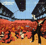
In 2001, Q Magazine published a special version of their magazine, "Q's 100 Best Record Covers of All Time". One Chemical Brothers album cover made the list, "Surrender". Below is the text of the article, written by Ian Harrison.

"We liked the idea of everyone else
sitting down and being chilled out and just one person really getting
it," says Ed Simons. "Like one of our gigs in the Midwest,
actually".
Individual
transcendence was of vital importance to "Surrender". Intended to get
people in touch with the moment of sublime release only a packed dancefloor and
irresistible sounds can provide. The Chemical Brothers' third album was to be
their magnum opus. The sleeve, similarly, captured what it's like to be swept
away by the moment, when the exterior world loses all meaning and deeper truths
are revealed. However, in February 1999 the duo were confronted with a novel
problem: they had, in Simons' words "about two weeks" to sort out an
album cover, plan a live show, and do endless promotional duties in Japan.
"We
had a lot of starting points," remembers Blue Source designer Mark Tappin,
who also did the "Brothers Gonna Work It Out" mix CD. "They had a
strong idea of what they wanted, they were just unclear on what it should
be."
Simons
and his partner Tom Rowlands were spending most of their time editing down the
tracks for "Surrender". When they had a spare moment, they would sort
though hundreds of images from the Hulton Getty picture library with Tappin,
including many images of festivals from the '60s and '70s. The prompt for the
final cover's visual flavour, though, came from another area entirely.
"There
was a picture of an American family who'd been abandoned by the side of the
road," says Ed. "A very desolate picture in some ways, but it had
these big blocks of colour on it and a rainbow spectrum running though it. We
felt that our music was quite like that - taking tiny segments of quite mundane
music and bringing them to life".
Tappin
started manipulating some of the prototype images digitally, but they were
rejected as looking too sterile. Enter screen printing artist Kate Gibb. She had
never worked on a record cover before, and her manual techniques were anthema to
modern design practice. After discussing the project, however, the Brothers
found their ideas converging with Gibb's. "I think the 12" vinyl
sleeve was Tom and Ed's point of reference," explains Tappin, "They
were keen to make sure it would still work in a few years, and as they use quite
organic techniques in their music, it made sense to realise the sleeve in the
same ways,".
"There's
no computers involved in screen printing," adds Gibb. "No two prints
are the same, each one is a surprise. And because it looks retro, it stops
ageing. "
Continuing
to trawl though the Hulton Getty library, in search of what Gibb calls "the
right moment of euphoria", Simons, Rowlands, Tappin and Gibb selected about
15 images, of which 6 made the final cut (the singles from "Surrender"
and its inner/outercover). Though the "Out of Control" single image
nearly made the album cover, Simons says they always knew that a celebratory
picture taken at The Great British Music Festival in 1975 was the one. To arrive
at the finished image, Gibb followed a process of trial-and-error, trying differ
rent colour schemes, and sending jpegs to the Brothers in Japan. The rainbow
coloured patches on the cover were hand painted: "It gave it an extra bit
of life", says Gibb. The whole process took four months.
Kate
Gibb now has a Where's Wally like scrapbook of herself standing in front of
billboards advertising "Surrender" all over London, while Rowlands and
Simons have screen prints of all the sleeve images on their walls at home.